Malte Köhn, our Design Director, spends a lot of his time thinking. He’ll sit at home, or in his office, or on the train – anywhere, really – planning out whole new product lines in his head. He thinks about what they’ll look like, what they’ll be made from, which tiny touches they’d have to set them apart from everything else on the market. Then come the sketches. Endless sketches of ranges, details, shapes, finishes, colours…
They’ll be great, of course – that almost goes without saying, coming from the guy who designed the new Contour, the updated Focus XD range and the stunning LYD 48 studio monitor. But it’s still a process: some of those initial, back-of-an-envelope ideas won’t have that ‘wow’ factor. The ‘if we don’t build this, we’re idiots’ factor.
“The Music family came out of that frustration; that process,” Malte says. “I had five other concepts for it: some square, some round, some other weird things, but nothing that really made me think ‘wow – that’s cool!’.
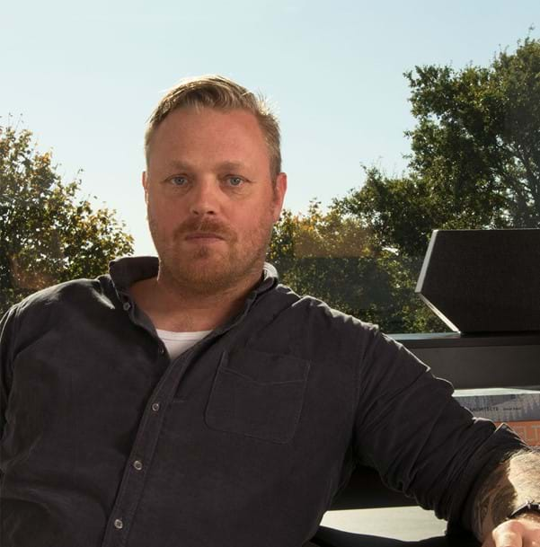
I wanted to design a product that really made me think ‘wow – that’s cool!’
Malte Köhn, Design Director
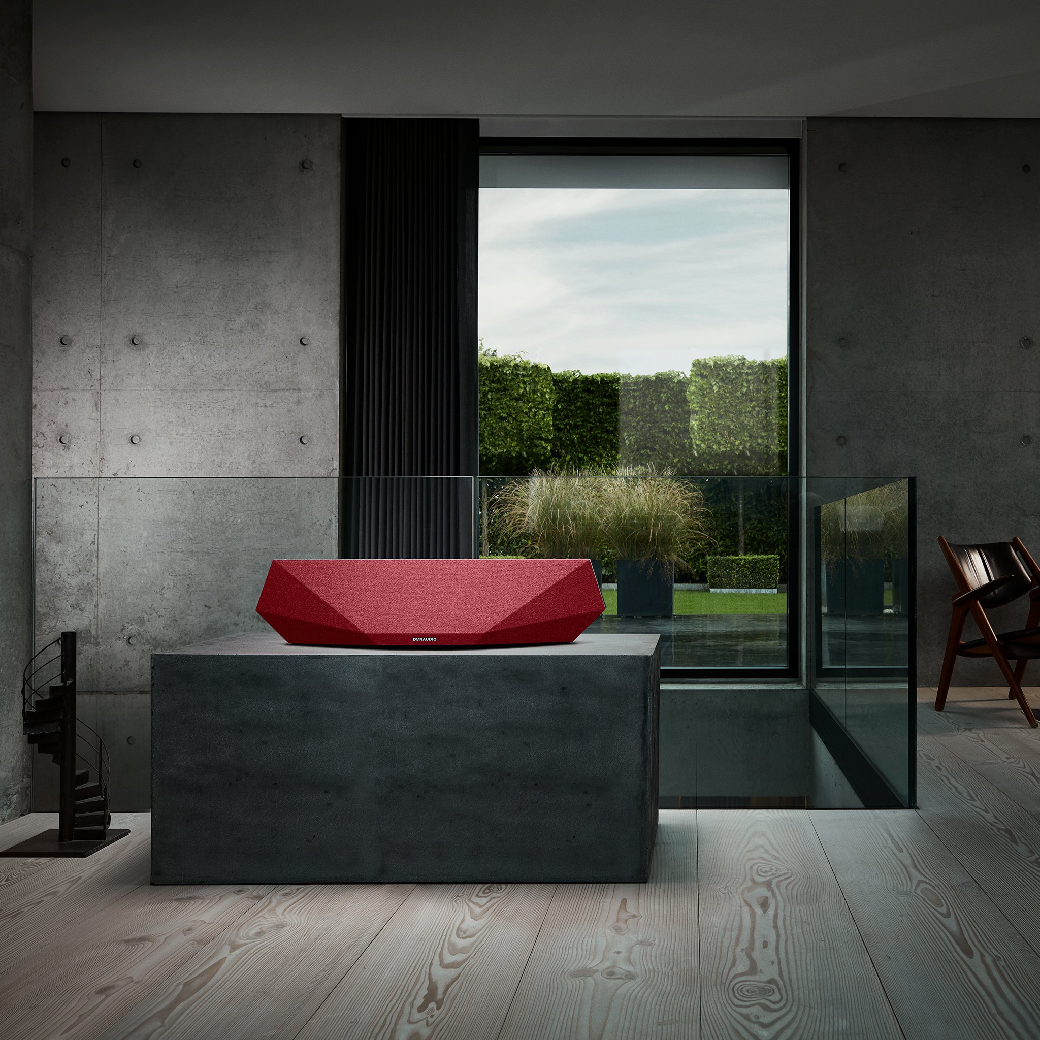
“So, I was sitting in the evening and just sketching, and I drew the front – with those lines – because I’d started wondering if we could angle the drivers in a way to make the product sound much bigger than it looks. I wanted to see how we could support its acoustic performance through design.
“The first one I drew became the Music 5. I wanted to make a product that people either love or hate. In between, there are so many that are just too mainstream; their design language is too average. I wanted to come up with something based on our acoustic principles that also had a really different look.”
That thought experiment quickly blossomed into the range you can see on these pages. “I wanted to design a product that, when you first see it, you’re like ‘Nice’. Then you look at it more and really start to discover it. It has to be timeless, because think about generations two and three…” (If there’s one thing Malte is definitely not guilty of, it’s not thinking ahead.)
“We needed a foundation strong enough to carry; strong enough to handle all the updates that will hopefully come in the following years.”
One family, four members
These speakers aren’t just bigger or smaller versions of each other: they have different numbers of drivers, they fulfil different roles in their owners’ lifestyle, and they come in at different prices. So how do you expand one design into four?
“I started with the Music 5, but you can see that the Music 7 is very similar. It has more drivers, but it’s more than just being bigger,” Malte explains. “Taking your first product – your first darling – and then just scaling it up and down is really dangerous. You have to look at the main characteristics, the facets and the user interface, and then try to incorporate them into what’s essentially a brand-new product. Music is one family, then, but four separate products.” (If there’s another thing Malte is definitely not guilty of, it’s being unambitious.)
Having that same DNA, that same recognisable line running through the whole family, was essential in the design process. It’s also something you can see in the finish, the colours and the special cloth.
Malte’s worked in textiles before himself, so when he looked at the standard stuff available on the market, he knew immediately that he had to go a different way. “We chose Gabriel because it’s an old Danish company. They really fit into our philosophy of quality and craftsmanship,” he says. “We went to them and looked at the current cloth as well as some different, more standard materials. Those more basic ones just didn’t work very well because of how three-dimensional these speakers are – so we went with a more three-dimensional finish to the cloth, too.”
It’s an approach that’s really paid off, Malte says, pointing out how the speaker looks different in different light and from different angles: “They have a liveliness about them. The shape seems to change as you walk around them, and I think the fabric really supports that.”

Front to back, outside in
Bigger boxes almost always help when it comes to getting bigger sound, but for speakers like this going all rectangular seems like a wasted opportunity. Malte began by sketching the back side as a basic box, but found that the physical volume made things too bulky.
“Everyone can make a box and put it somewhere in the house, but making a product that looks nice on the table from all angles is really difficult. I wanted to make these as slim as possible, at least visually,” he explains. “So now when you look at it you have the long axis – like a mirror, basically. That’s also why we put the cloth on the back, even though it doesn’t serve any acoustic purpose.”
There were just as many discussions about what sits under the cloth. You can remove the grille cover on the Music 5 and Music 7, so it was every bit as important for the team to make look them nice once disrobed. Nice-looking materials, however, aren’t always the best for performance. “Plastic has its own aesthetic, so we wanted the material we chose for the baffle to look nice too. It’s very matte on the surface, and acoustically it’s very dead. It’s just a totally honest material – this is how it looks and performs when it comes out of the mould.”
One-touch simplicity
The team was also adamant about making sure Music is easy to use. Remember your old radio? You pushed a button to turn it on, and then you were listening. You tuned it to another favourite station by pressing another button or turning a dial. And that was the end of your involvement – the DJs did the rest.
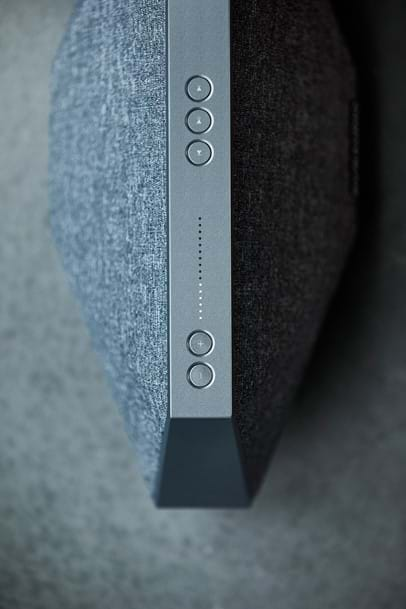
Malte and his crew talked about all sorts of fancy control methods – touch-sensitive glass, hidden sensors in the aluminium frame and more – but rejected them all. “We were sitting there and then just said: ‘You know what? This should be a really simple thing. The feeling of touching a button hasn’t changed in the past 100 years’. So we went with buttons.”
Buttons are solid. You can use them when you’re wearing gloves, or when you’re cooking and have sauce all over your fingers. They just… work.
“When we look at the Music 1 and Music 3, there are still buttons – but because the speakers are a different shape, we had to look at how else they could be used. We wanted to get across the fact that these two speakers are portable, so we built them into the frame, which also doubles as a handle.”
We printed our prototypes
Iteration is one of the most important parts of design, which is why the Music family went through an absolute boatload of prototypes. It was teamwork, Malte says, that got the job done. “I went to my team with something that I thought looked really interesting. They liked it, so we took it to the product-management guys, and they told us it looked really cool. I started sketching it in 3D the same evening. The marketing team saw it after that and wanted to get their hands on it because it didn’t look or behave like anything we’d done before. Then we took it to the acoustics guys, who said ‘Oh yes. We can really do something with this!’.”
The design team worked closely with the acoustics team, lines and positions, to really dial in on the final shape. A driver moves, an angle or a facet has to change. Then the DSP needs tuning again. Back and forth, back and forth. Then they print out a playing prototype. Yes, print.
“We sent the design file to our local 3D-printing suppliers, and they produced it in SLA – which is an incredibly stiff, stable plastic that’s very close to the final material. It was really important to get it as close as possible so we could work on the waveguides and the bass ports.”
That 3D printing approach made prototyping quick and easy, too, Malte continues: “We made 10-15 full versions, but also lots of different components. We designed the models in a way that made it easy to swap out parts rather than making a whole new unit.”
The Music 5, for instance, had a vertical split along the whole centre-line. It meant the team could experiment with different back shapes once they’d got the front right. They made rough mock-ups from milled foam to get the shape and size right, then went to 3D-printed SLA for acoustic testing.
For the love of it
You have to love what you’re designing. You have to be able to look at it and want it in your house to know you’ve got it totally right. And you have to be able to see new details when you look at it – even when you came up with it in the first place. “It still surprises me that if you look at it from one end, it looks like an upside-down ship,” laughs Malte. “It’s dynamic, but it’s still very calm in its expression.”
He’s cagey about what’s sitting on his drawing board for future versions, of course – but if the first Music family is anything to go by, it’s pretty clear that it’ll look every bit as spectacular.
Sign up to get more great articles
Nothing compares to the satisfaction of knowing – for a fact – that something is as good as it gets


